The colours we surround ourselves with do far more than simply look attractive. Research in environmental psychology has long demonstrated that colour influences our mood, energy levels, appetite and even our perception of temperature. Yet when it comes to decorating our homes, many of us choose paint shades based on trends rather than how they will genuinely make us feel.
Warm Tones: Energy and Comfort
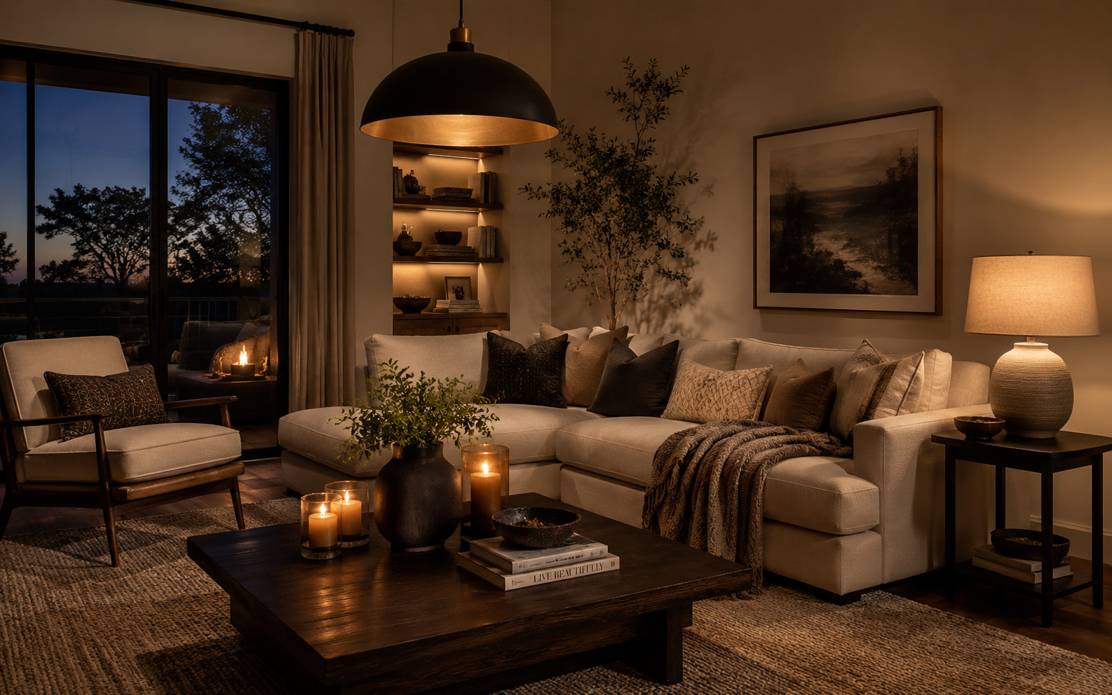
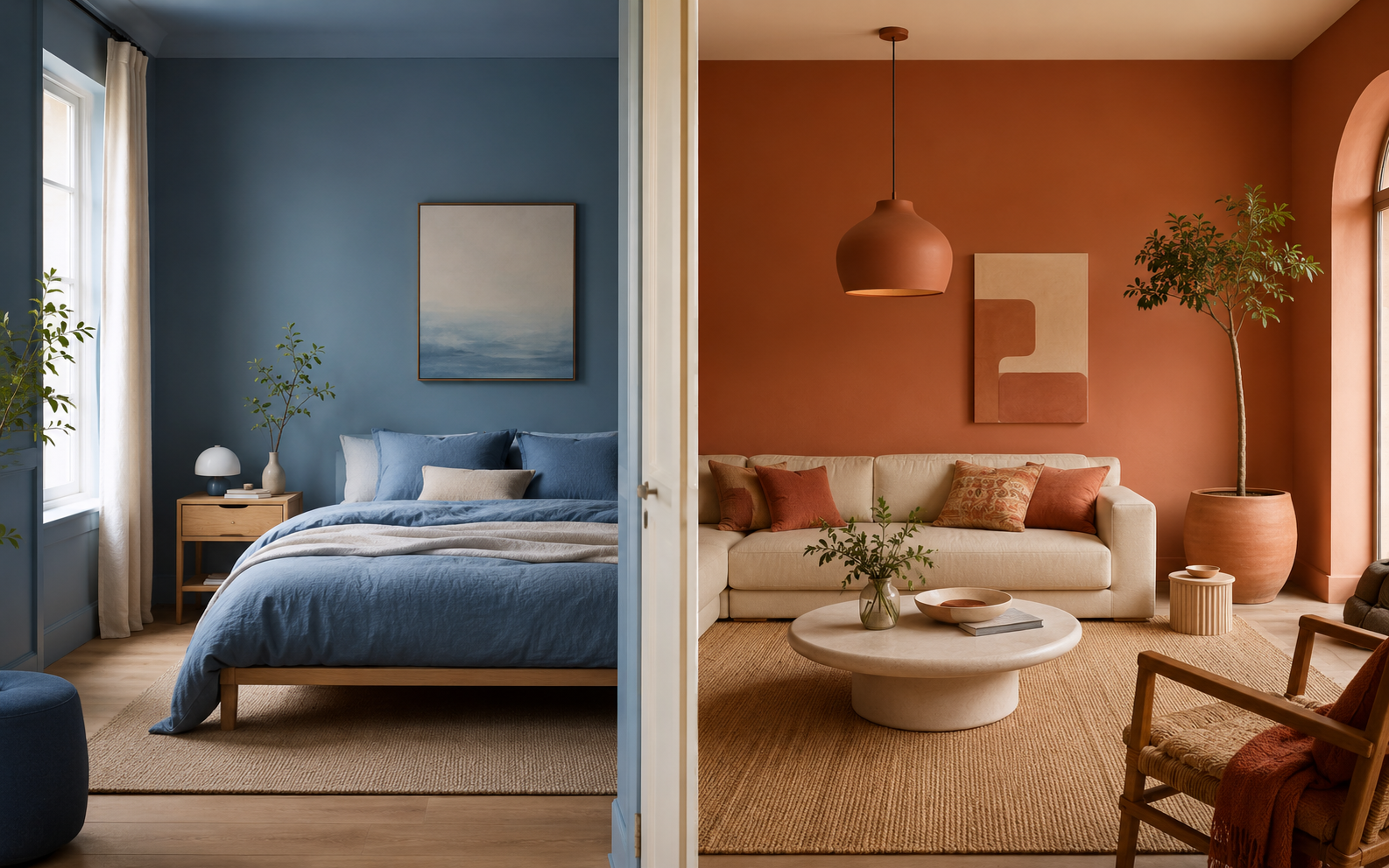
Reds, oranges and warm yellows are stimulating colours that can raise energy levels and encourage conversation. A deep terracotta in a dining room creates a sense of warmth and intimacy that draws people together around the table. Burnt orange in a living room feels welcoming and cosy, particularly during the colder months when natural light is scarce.
However, warm tones demand careful handling. Too much red in a bedroom can feel agitating rather than restful, and bright yellow in large quantities can overwhelm the senses. The trick is using warm colours as accents or on a single feature wall, balanced by calmer neutrals on surrounding surfaces. As noted in research on interior design, the relationship between colour and spatial perception has been studied for over a century.
Cool Tones: Calm and Focus
Blues and greens are inherently calming. Soft blue in a bedroom promotes restful sleep, while sage green in a study or home office supports concentration without the sterility of pure white. These colours mimic the natural world, evoking sky, sea and foliage, which may explain why we find them so instinctively soothing.
Deeper cool tones like navy or forest green can add drama and sophistication to a room. A navy accent wall in a living room creates a striking backdrop for artwork and warm metallic accessories. Forest green in a bathroom produces a spa-like atmosphere that feels both luxurious and grounding.
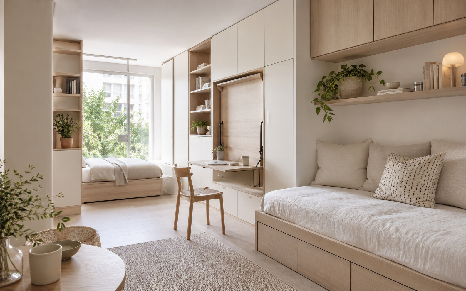
Neutrals: The Quiet Foundation
Whites, creams, greys and beiges often form the backbone of a colour scheme, providing a calm canvas against which other elements can shine. But not all neutrals are created equal. A cool grey can feel clinical in a north-facing room that receives little sunlight, while a warm cream might feel dull in a space flooded with natural light.
The current move towards warmer neutrals, think oatmeal, mushroom and stone, reflects a desire for interiors that feel comforting rather than stark. These tones work beautifully alongside natural materials like timber and linen, creating spaces that feel organic and unhurried.
Choosing Your Palette
Start by considering the purpose of each room and how you want to feel when you are in it. Energised and social? Look to the warm end of the spectrum. Calm and focused? Cool tones are your friend. Remember that paint looks very different on a small swatch than it does covering an entire wall, so always test colours in situ, observing how they change throughout the day as the light shifts.
The most successful interiors rarely rely on a single colour. A layered palette of two or three complementary tones, combined with texture and pattern, creates depth and interest that a monochrome approach simply cannot achieve. Trust your instincts, and live with samples for a few days before committing.